Thanks to the enormous popularity of Instagram, square photos have become the standard of mobile photography, forcing mobile photographers to adapt to this unusual photography format. In this article you’ll discover the best composition techniques for taking amazing square iPhone photos that will get your images noticed on Instagram.

Much has been said about composition techniques in traditional photography formats. From the rule of thirds to advanced composition guidelines, there’s an abundance of advice for composing photos in landscape and portrait orientation.
However, a lot of that advice is not directly applicable to photos in square format, which is why I decided to write this article. So let’s take a look at some important composition techniques to consider when taking square photos.
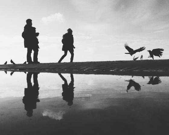
1. Place Your Subject In The Center
One of the most common composition “mistakes” in traditional photography is placing your subject right in the center of the frame. Almost all composition tutorials will advise you to not place your main subject in the center of the image.
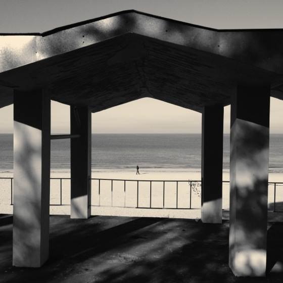
And yet that’s exactly what I did in the photo above. Not only have I centered the small silhouette of a man, but the structure in the foreground is also centered to put even more emphasis on the central part of the photo.
Generally speaking, central subject placement works great in square photos as long as the subject is so strong that it can stand on its own and keep the attention of the viewer.
2. Fill The Entire Frame
When you think about the composition of your photos, you should always consider the medium in which the photos will be displayed. Are you making a large framed print, or will the photo be viewed on the tiny screen of an iPhone?
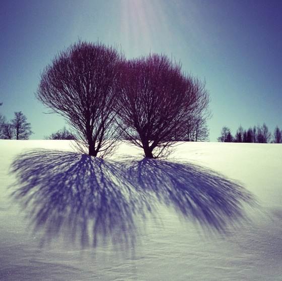
If the primary goal of your photo is to showcase an unusual subject (or a group of subjects such as the two trees and their shadows in the photo above), it can be a good idea to let the subject fill the entire frame of the photo. While normally you would try to put your subject in the surrounding context, you often don’t have that luxury in tiny Instagram squares.
3. Make Use Of Symmetry
Symmetry is yet another technique that works really great for square photos, even if it breaks the basic composition rules such as the rule of thirds.
Just like central subject placement, symmetry is great for putting a strong emphasis on one central subject that takes up the entire visual weight of the photo.
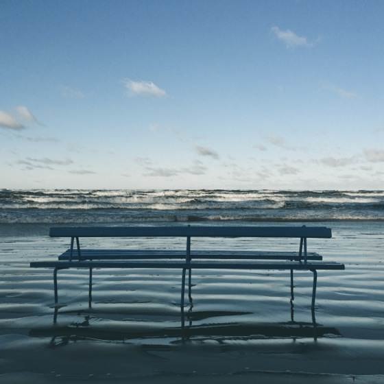
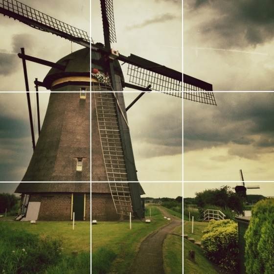
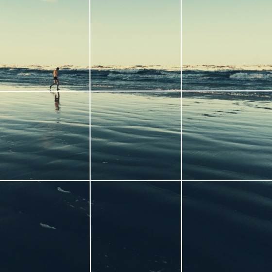
4. Be Careful With The Rule Of Thirds
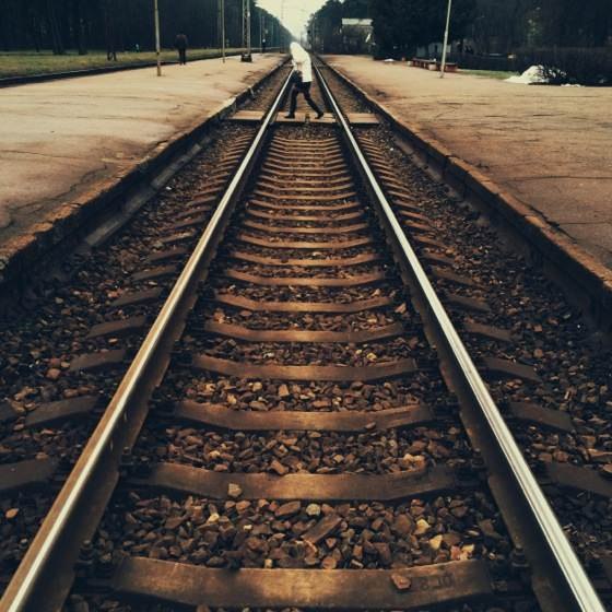
The rule of thirds is by far the most common composition guideline, and while it works best for landscape photos, there are times when it also works in square format. From my experience the rule of thirds works best if the subjects are large, such as the windmill below.
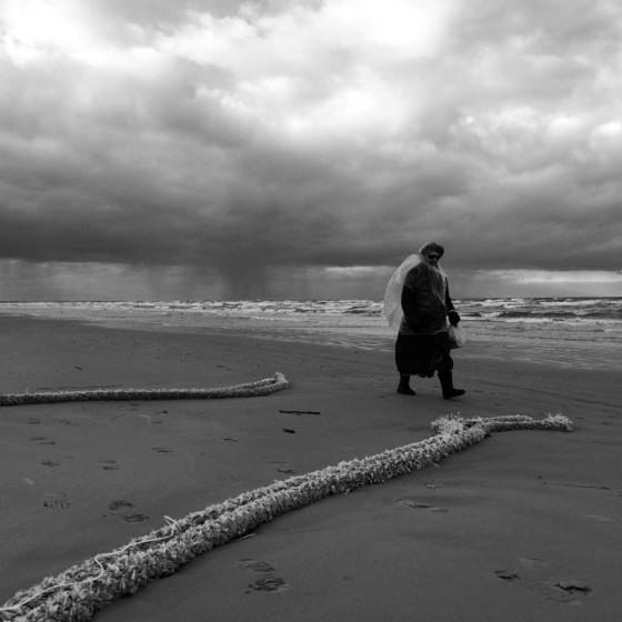
However, for smaller subjects I often get better results by moving the subject more towards the edge of the photo. In the following photo placing the man at the intersection of the gridlines seemed far too central, so I placed him more towards the left edge which allowed me to put more emphasis on the vastness of the beach.
The same principle can be seen in the following portrait photo. The face of the boy is placed more towards the edge of the photo in order to position him in the surrounding context.
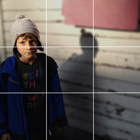
You can see how this photo was processed in my Tadaa HD photo editing tutorial.
5. “Upgrade” The Rule Of Thirds
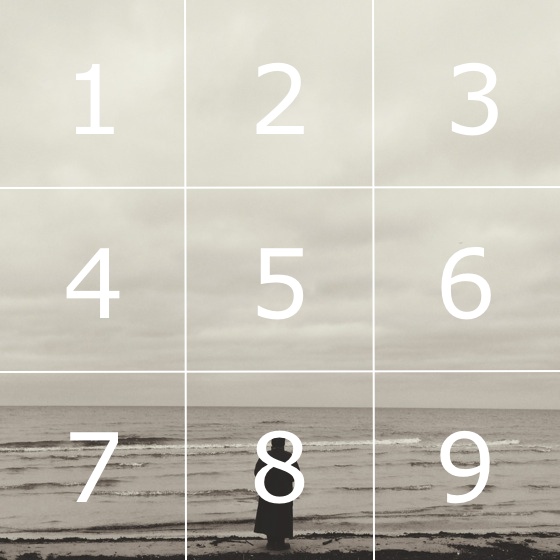
Rather than simply placing the subjects “more towards the edge” than suggested by the rule of thirds, it can be very helpful to think about your square photos in terms of smaller squares that are created by the gridlines.
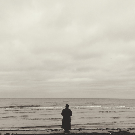
Let’s apply this concept to the photo of a lone woman on the beach.
After applying the squares, you can see that the women is placed centrally in square 8. From my experience small subjects that fit into one square should be placed in the center of any of the eight squares on the outside, while square 5 should be reserved for very strong subjects only.
In this example the subject is placed almost entirely in square 3, which looks much better than placing the subject at the intersection of the gridlines.
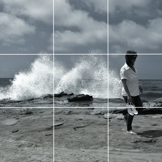
If your subjects are taller (such as a standing person), you can combine the different squares into zones, where the subjects can once again be placed centrally. For example, in the following photo squares 3, 6 and 9 are combined to create a zone in which the woman is placed centrally, while squares 4 and 5 create another zone for the splashing water.
Dividing photos into smaller squares and then combining them into zones is a tip I picked up from iPhone Camera Essentials video course. My readers can get a 50% discount for iPhone Camera Essentials through this special discount link.
6. Use The Diagonals
One of the most useful compositional guidelines is the diagonal principle, and it works really well for square photos. The diagonal principle states that you should place the important subjects in your photo diagonally so that it stays balanced both horizontally and vertically.
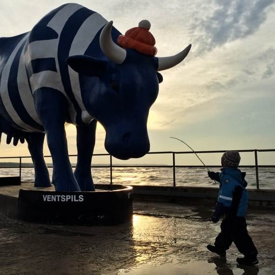
In this photo the two main subjects – the boy and the massive cow – are positioned diagonally. This puts more emphasis on the interaction between the subjects, makes the cow appear much, much larger and also keeps the photo balanced both horizontally and vertically.
7. Lead The Eye Towards The Subject
Leading lines are any lines that draw the attention of the viewer toward the main subject of your photo. While leading lines tend to work well on any photography format, it can be challenging to put them into a square format simply because there isn’t enough space for them.
Due to the way we look at photos (first foreground, then background) and read text (left to right), leading lines extending from the bottom left tend to work best in landscape photos. However, in square photos there’s often not enough space for that kind of arrangement, and you can also use leading lines extending from the foreground into the background.
8. Use Empty Space
Steve Jobs used to say, “Simplicity is the ultimate sophistication,” and he was clearly onto something. It’s hard to make a crowded, messy photo look good, and this is especially true for small square photos where you have less space to spread out your subjects.
The solution is to include more negative (empty) space to your photos, which makes it much easier to crate a harmonious composition using the other guidelines from this post.
9. Shoot In Landscape, Then Crop
Most photography apps, including the native Camera app in iOS 8, give you the option to take square photos. While this helps you compose square photos more accurately, it also means that you capture less pixels and have less flexibility in cropping stage.
For this reason I capture all my photos in landscape (or sometimes portrait) mode, keeping in mind that most of them will be converted into squares afterwards. Of course, there will be times when you take a great photo that can’t be cropped into a square, but I think that’s a risk worth taking.
If you’re still struggling to take good square photos in landscape mode, VSCO Cam has a great square mode which still saves your photos in landscape for maximum flexibility at the time of cropping.
10. Break All The Rules
Always remember that there are no hard rules in composition, and while it certainly helps to know the tips and guidelines that are discussed in this post, you should always trust your gut feeling and not be afraid to ignore all the composition tips and guidelines if that feels right to you.
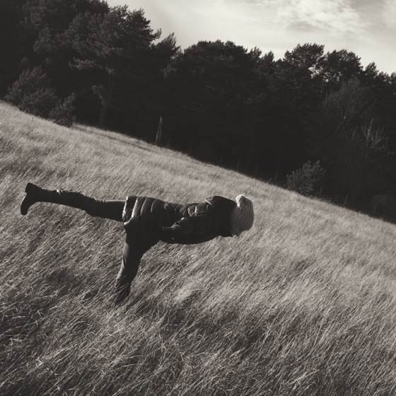
The photo above breaks almost all the composition tips that were discussed in this article, and yet there’s nothing I would change about it if I had a chance. Sometimes you just have to follow your heart and forget about everything else.